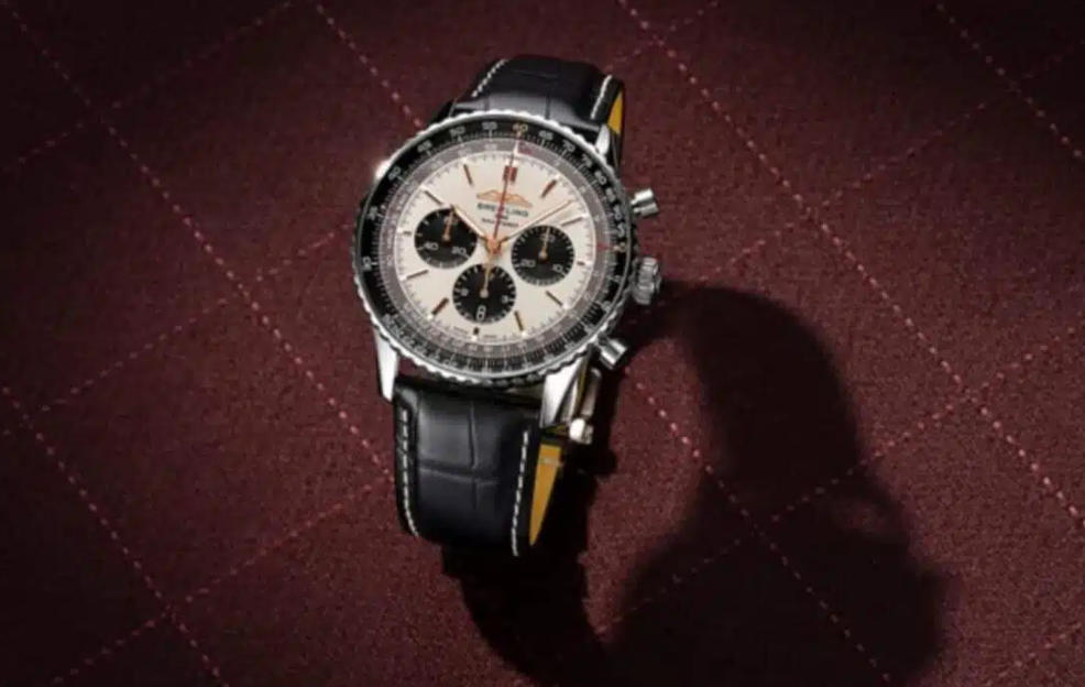
The Navitimer is difficult to simplify. Its identity comes from the circular slide rule, dense scales and chronograph registers, so even small changes in printing or spacing affect the whole dial. The SWISS edition adds airline related colour and branding to that already complex layout. For a replica comparison, those visible details are more useful than phrases such as 1:1 or perfect copy.
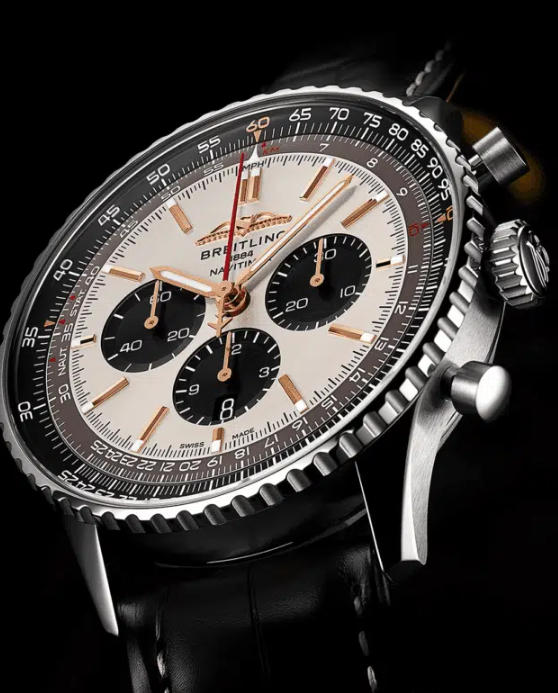
The slide rule is the first place to look
The Navitimer bezel and outer scale create a continuous ring of fine markings. The numerals need to remain readable without appearing too heavy, and the spacing between the rotating outer scale and fixed inner scale needs to be consistent. When printing is thick or the bezel is too wide, the centre dial can look cramped.
The 46mm format gives the design more room, but it also makes proportion errors easier to see. Lug length, bezel height and crown size all contribute to whether the watch feels like a large Navitimer or simply an oversized chronograph.
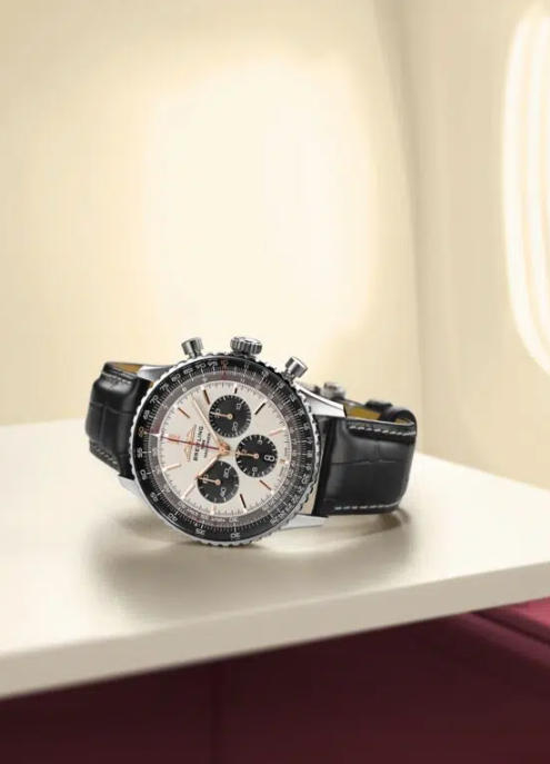
Airline colours should support the dial rather than dominate it
The special edition styling introduces warmer tones and SWISS branding while preserving the familiar three register layout. The strength of the design is that the aviation reference is specific without turning the watch into a novelty piece. A replica should therefore be judged on how cleanly those colour accents are integrated with the existing dial architecture.
The original article used promotional language about luxury, perfection and everyday water resistance. This rewrite removes those claims. Water resistance on a replica should never be assumed from the specification of the genuine watch; it requires pressure testing of the individual piece.
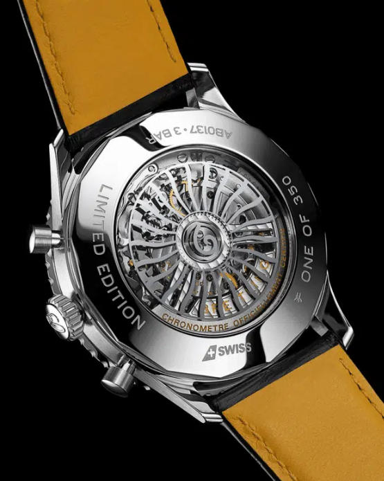
Movement presentation is only one part of the comparison
The genuine Navitimer B01 family is associated with Breitling’s manufacture chronograph architecture, but a replica movement should be identified according to what can actually be verified. Decorative bridges, rotor engraving or a supplier’s B01 label do not establish the same construction or performance.
When comparing the version shown here with other Breitling replica watches, look at chronograph register behaviour, pusher feel, hand alignment and case thickness. Those observations provide more useful information than a factory quality adjective.
Printing density can reveal more than movement decoration
The Navitimer contains more fine text than most watches, so printing quality is one of the most revealing comparison points. Small numerals should remain distinct under magnification and the logarithmic scales should not merge into a dark ring. Inconsistent ink density can make the dial look blurred even when the overall colour scheme is correct.
The hands also need enough contrast to remain legible against the scales. A technically accurate dial that is difficult to read misses an important part of the Navitimer’s instrument character.
A Navitimer succeeds through organised complexity
The appeal of this SWISS edition is the way a crowded instrument style dial still feels ordered. That is also the standard a replica needs to meet. Crisp scales, correct register spacing and a case that does not overpower the dial matter more than a claim of exactness.
SpankWatches has kept the URL because the page has already earned search impressions, but the content now reflects an editorial comparison rather than a keyword driven sales page.
